When used correctly, color can be extremely impactful
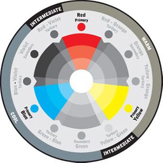
Primary Colors
Red, blue and yellow are the three primary colors that cannot be made by mixing any other colors. These three colors can be mixed to create all other colors and can be combined with white or black to create tints (lighter tones) and shades (darker tones) of these colors.
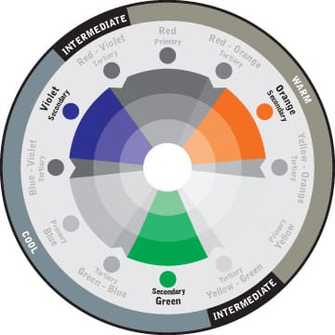
Secondary Colors
Secondary colors are created by mixing two primary colors together. For example, mixing blue and red make purple, red and yellow make orange, and yellow and blue make green. The exact color of the secondary color you get depends on which red, blue or yellow you use and the proportions in which you mix them.
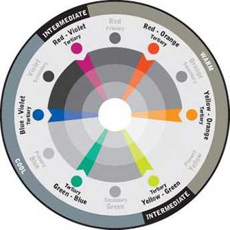
Tertiary Colors
If you mix three primary colors together, you get a tertiary color, which can also be made by mixing primary and secondary colors. Varying the proportions of these colors creates different tertiary colors.
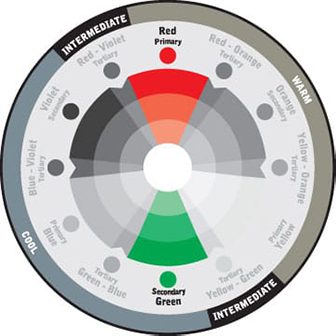
Complimentary Colors
Using colors that are opposite each other on the color wheel creates visual excitement. When these warm and cool colors mix, they energize each other, bringing any décor to life. Complementary colors offer stronger contrast than any other color scheme and draw a lot of attention. They can, however, be harder to balance than other schemes, especially when working with desaturated or warm colors.
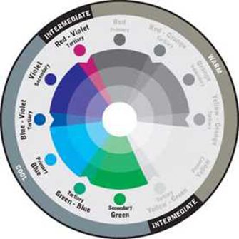
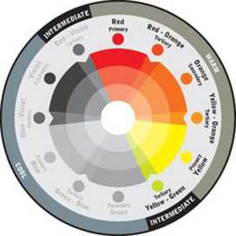
cool colors
Blues, greens and violets are perceived as cool colors. Small areas feel spacious and calm when cool colors are used.
The temperature of a color – must be considered both individually and when used with other colors.
warm colors
Reds, oranges and yellows are considered warm colors. Large areas feel cozier and more intimate in warm colors.
The visual temperature of a color can accentuate or change the look and feel of your project.
Sign up for email updates
Looking for More?
At Florida Paints we love helping our customers. If we can help you give us a call or contact us.